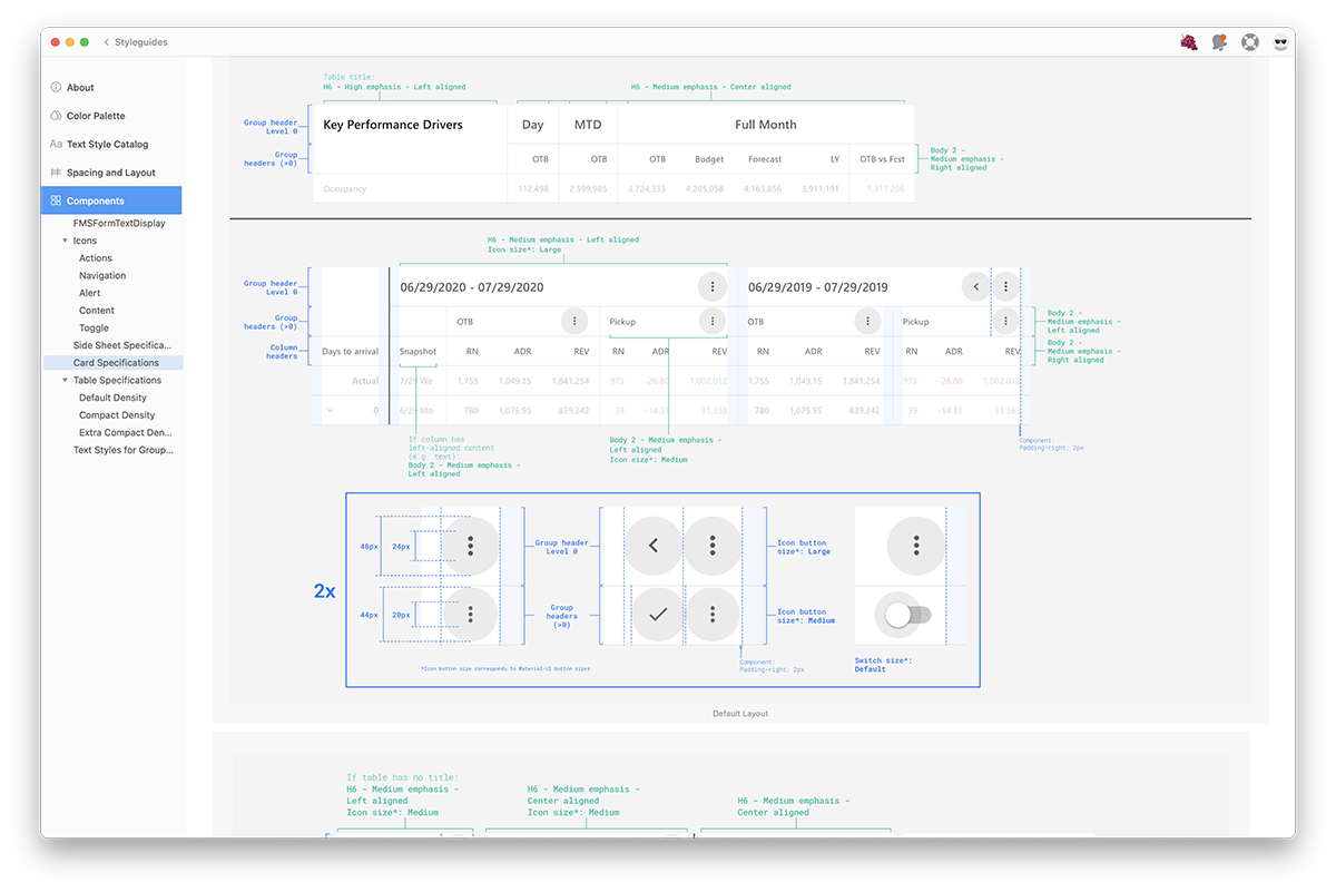
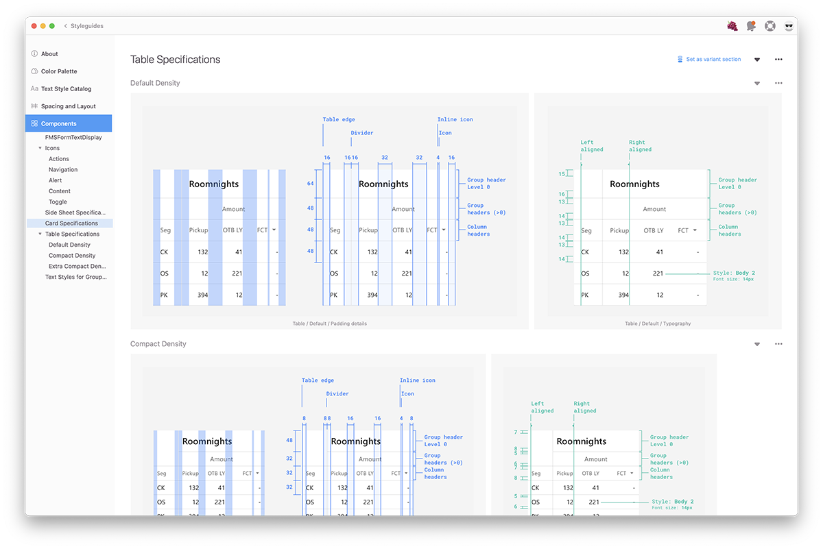
Fairmas Design System
development of a design system and design definitions for an entire web-app with multiple functions
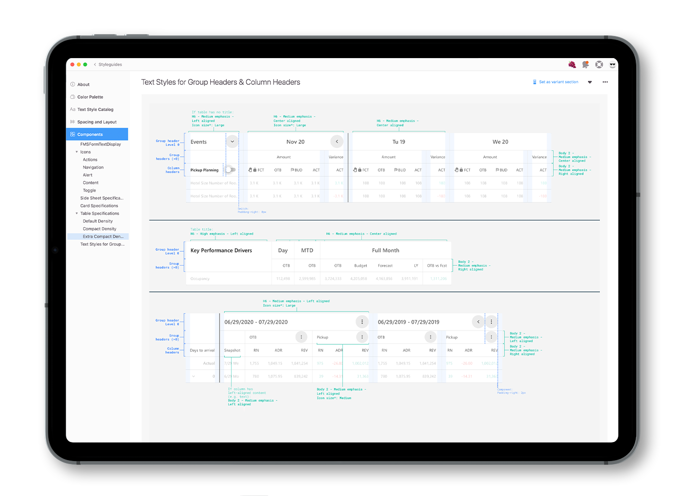
development of a design system and design definitions for an entire web-app with multiple functions

Highlights
Documentation is key
The system should be clear to use and understand for every new designer or programming joining the company
Where the system is developed can be crucial
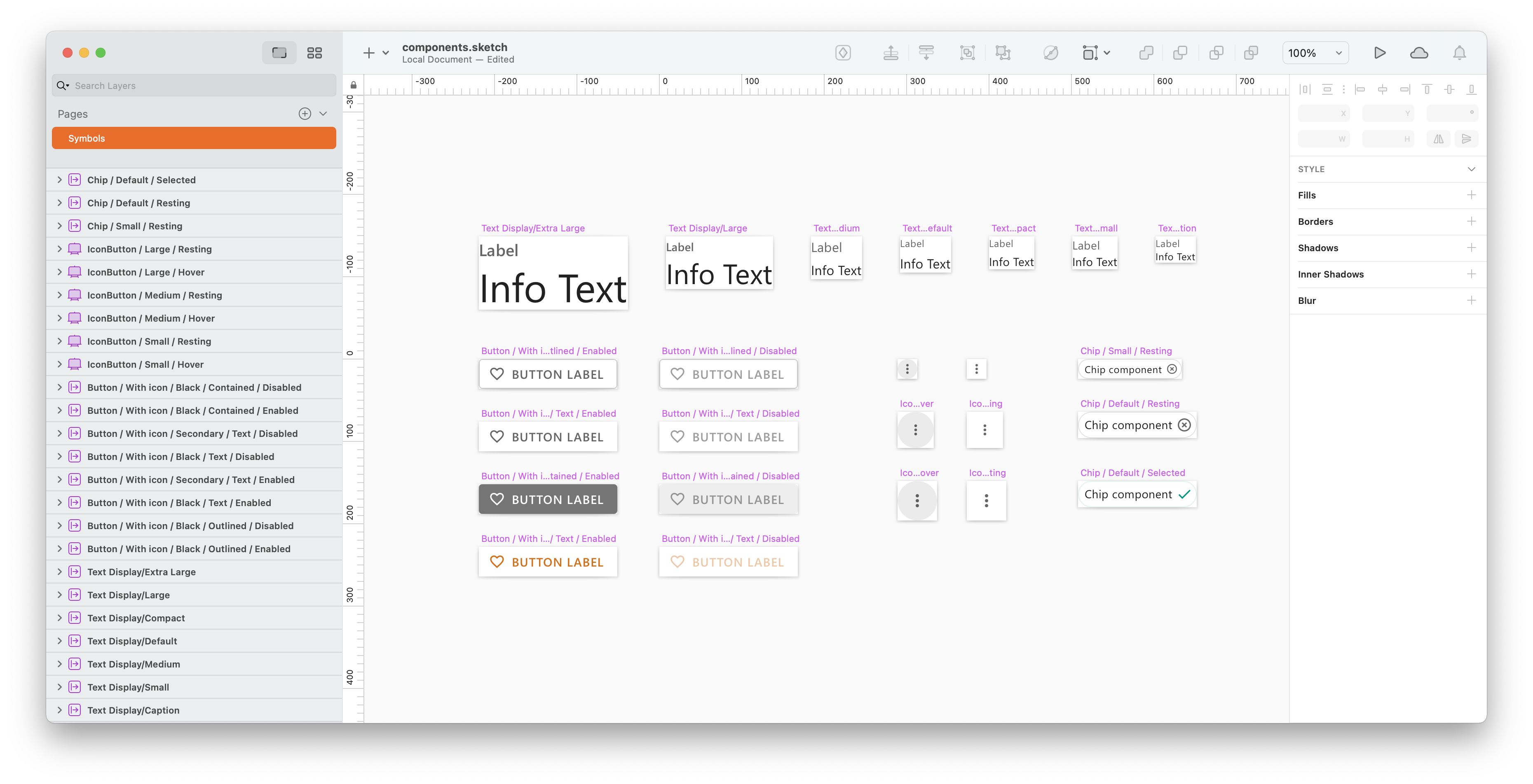
Though Sketch is a great tool to design, sometimes the updates complicate the maintenance of the library.
Background
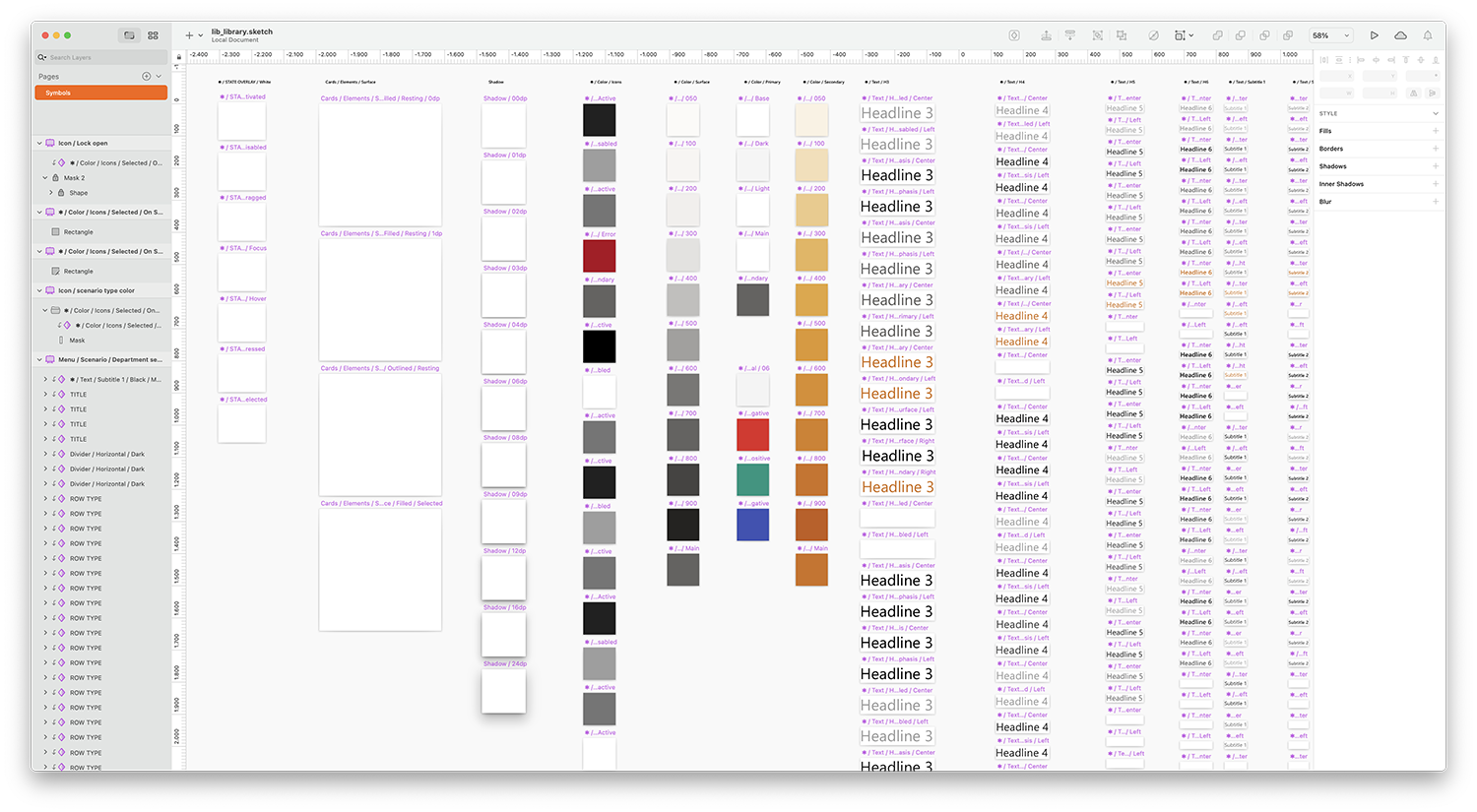
A few months before joining the company, Fairmas started the redesign and improvement of their web-based solution. With the expansion of existing products and the development of new ones, it became clear a more systematic way of designing was needed. This led the company to create a first component library based on Google’s Material Design principles.
Understanding the problem
As I started working with the existing library, and with a continuous adapting of old sites to the new design, new challenges emerged.
Even though the available system defined most of the components needed by the application, how each of them related to one another had not been specified, most of them needed adjustments to be easier to translate into ReactJS.
Unifying the design system
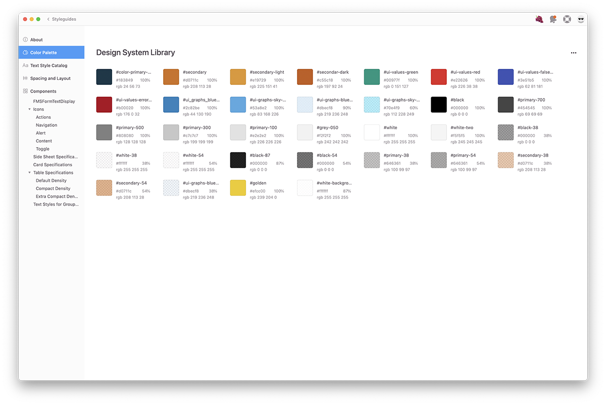
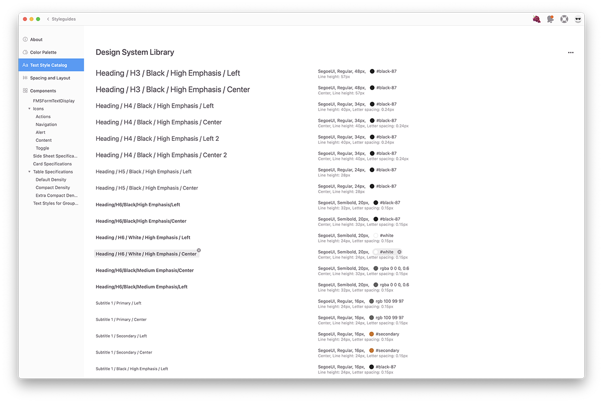
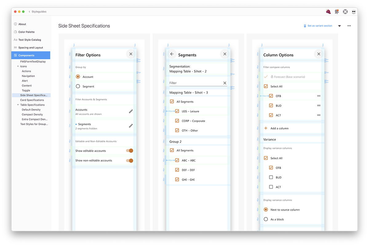
In order to create a unified range of products, I started by doing an audit of the available and missing definitions. This resulted in several tasks:
Unifying the design system
The entire system is based on Google’s Material Design. This offers a few advantages:
